Use Cases for Placeholder Images in Modern Web Design
Placeholder images are essential tools for web designers and developers, making it easy to mock up layouts, test responsiveness, and present polished prototypes—long before final media assets are available. This guide explores the most practical and creative ways to use placeholder images in real-world web design workflows, sharing actionable tips, code samples, and best practices for responsive, retina-ready, and accessible image slots.
Why Use Placeholder Images in Web Design?
Placeholder images speed up the design and development process by allowing you to focus on layout, functionality, and user experience before final assets are ready. They help you:
- Prototype page layouts and UI elements quickly, without waiting for photos or illustrations.
- Test responsive grids, breakpoints, and aspect ratios in real time.
- Communicate design intent to clients and stakeholders with realistic, visual mockups.
- Build reusable components (cards, galleries, sliders) that are image-ready from the start.
- Simulate loading states and error states during development.
Placeholder Images for Grid/Card Layouts: Responsive and Flexible Solutions
Placeholders are ideal for simulating image-heavy grids, e-commerce cards, team profiles, or blog feeds. Responsive grids rely on flexible aspect ratios and quick image loading—perfect for placeholder APIs.

<div class="row">
  <div class="col-md-4 mb-3">
    <img src="https://imageslot.com/v1/320x200?filetype=jpg" alt="Card image" class="img-fluid rounded">
  </div>
  <!-- Repeat for each card -->
</div>- Match your placeholder aspect ratio to the final expected image.
- Use
filetype=jpgfor fast loading;pngfor transparency.
Placeholder Images for Hero & Slider Banners
Hero images and sliders set the visual tone for a page. Placeholder images make it easy to define dimensions, test overlays, and preview mobile/desktop breakpoints—without the need for final artwork.
<img src="https://imageslot.com/v1/1280x480?bg=173559&text=Hero+Banner&filetype=png"
     alt="Hero placeholder" class="img-fluid w-100 rounded-3">
- Adjust placeholder width/height for desktop, tablet, mobile.
- Try
text=Your+Banner+Textto simulate overlays.
Placeholder Images for Loading States and Skeletons
Use placeholders to indicate loading content or create skeleton screens—improving perceived performance and keeping users engaged while real data loads.
<img src="https://imageslot.com/v1/640x360?bg=ececec&fg=6c757d&text=Loading...&filetype=gif"
alt="Loading skeleton" class="img-fluid rounded-2">- For animation, use
filetype=gifand animated text. - Change
bgandfgfor low-contrast, neutral skeletons.

Placeholder Images for Prototyping & UI/UX Testing
Quickly swap in placeholders for real images in Figma, Sketch, or live code prototypes. This allows you to validate layouts, flows, and accessibility before final assets are ready.
<img src="https://imageslot.com/v1/320x180?bg=1A726B&fg=fff&text=Avatar&filetype=png" alt="User avatar placeholder" class="rounded-circle">
- Use
rounded-circlefor avatars in Bootstrap, or mask in Figma. - Try different text to simulate user initials or content types.
Best Practices for Placeholder Images
- Match aspect ratio and size to the final expected image to avoid layout shifts.
- Use high-contrast colors for accessibility (
bg&fg). - Add descriptive
alttext for context or usealt=""for decorative images. - Choose
filetype=pngfor transparency;jpgfor speed;giffor animation. - Don’t use placeholders that mislead about content or proportions.
- Replace placeholders with real images before production launch.
Responsive & Retina-Ready Placeholder Image Integration
For modern web projects, placeholder images should look crisp and scale correctly across all device types. Use srcset and higher pixel densities for retina screens.
<img
  src="https://imageslot.com/v1/400x250?filetype=png"
  srcset="https://imageslot.com/v1/800x500?filetype=png 2x"
  width="400" height="250"
  alt="Responsive placeholder"
class="img-fluid rounded-2">- Use
srcsetto deliver crisp images on high-DPI displays. - Keep aspect ratios consistent for smooth layout transitions.
Accessibility Checklist for Placeholder Images
- Use descriptive alt text for placeholders if they set context; use
alt=""if purely decorative. - Ensure color contrast between text and background is at least 4.5:1.
- Do not use placeholders to convey essential info without alternative text.
- For complex graphics, consider ARIA roles or
aria-labelas needed. - Test with a screen reader and check keyboard accessibility.
- Replace placeholders with real content before launch for full compliance.
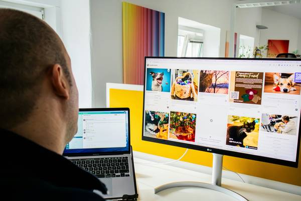
Placeholder Images in Real-World Design Mockups
Above: A typical wireframe or design tool screenshot, using placeholder images to visualize final layout and content flow.
Key Takeaways for Using Placeholder Images Effectively
- Pick aspect ratios, sizes, and filetypes that match your final assets.
- Use responsive images and
srcsetfor retina displays. - Prioritize accessibility: color contrast, alt text, and semantic markup.
- Leverage placeholder images for fast prototyping, testing, and seamless handoff to clients/developers.
- Replace placeholders with real images before your site goes live.
Frequently Asked Questions: Placeholder Images for Web Design
img-fluid class in Bootstrap, or set max-width: 100% in CSS to ensure images scale down on mobile. Combine with srcset for retina support. Always match aspect ratio and size to the grid or container for best results, and use responsive breakpoints when generating placeholders.
filetype=gif for animated placeholders, and consider neutral colors and subtle animation to indicate loading without distracting users. Animated skeleton loaders or progress indicators are common in modern UIs.
alt="" so screen readers ignore it. Always think about what information a visually impaired user would need.